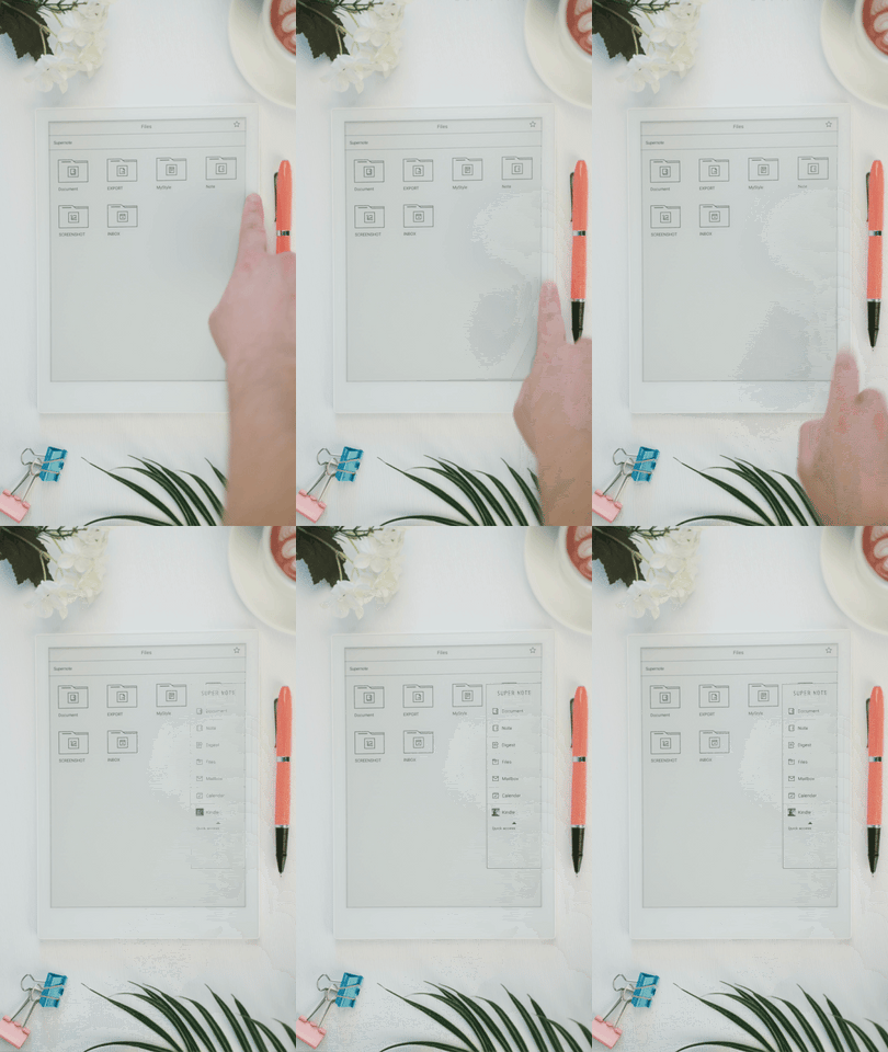
A side touch slider even better than the "Home" button
Supernote not only retains the refined elegance of traditional notebooks in appearance, but also inherits the simplicity and directness in the UI.
In common digital products, most of them use the home button as a gateway to the system and applications, which is convenient, but not convenient enough.

We found that in paper notebooks, tab sorting is the most common tool used, which is concise and clear and very efficient for accessing information. So, we've recreated the tabs in another way for Supernote - the side touch slider.
It doesn't take up much screen space, and sliding your finger from top to bottom will activate the sidebar, which corresponds to the core applications such as Note and Document, so it's simple and efficient to switch between them in one step.
Slide down to activate the sidebar, and slide up to refresh the screen to eliminate "ghosting". You may not be used to this novel interaction for the first time, but once you've spent a little time getting used to it, you'll love it because it's simpler and more effective.
Let's get started. Slide, slide, slide.
